Mind the Gap
Photo by Sammie Chaffin on Unsplash
When it comes to making effective advertising there are certain qualities that everyone knows to aim for. Or at least they should know to aim for. God knows, if you watch an ad break, scroll the socials or stroll down a billboard lined street you’d be forgiven for thinking some brands don’t really care about effectiveness. Anyway, griping aside, things like simplicity, single-mindedness and standing out are commonly recognised to matter. But there’s another equally important factor that is often overlooked and rarely discussed, and it’s one I’d like to consider here. Let’s call it the gap.
By ‘the gap’ I mean the space you leave in your communication for the reader or viewer. Most advertising, most of the time, leaves no gap. There’s an image, some copy and a message which is self-evident.
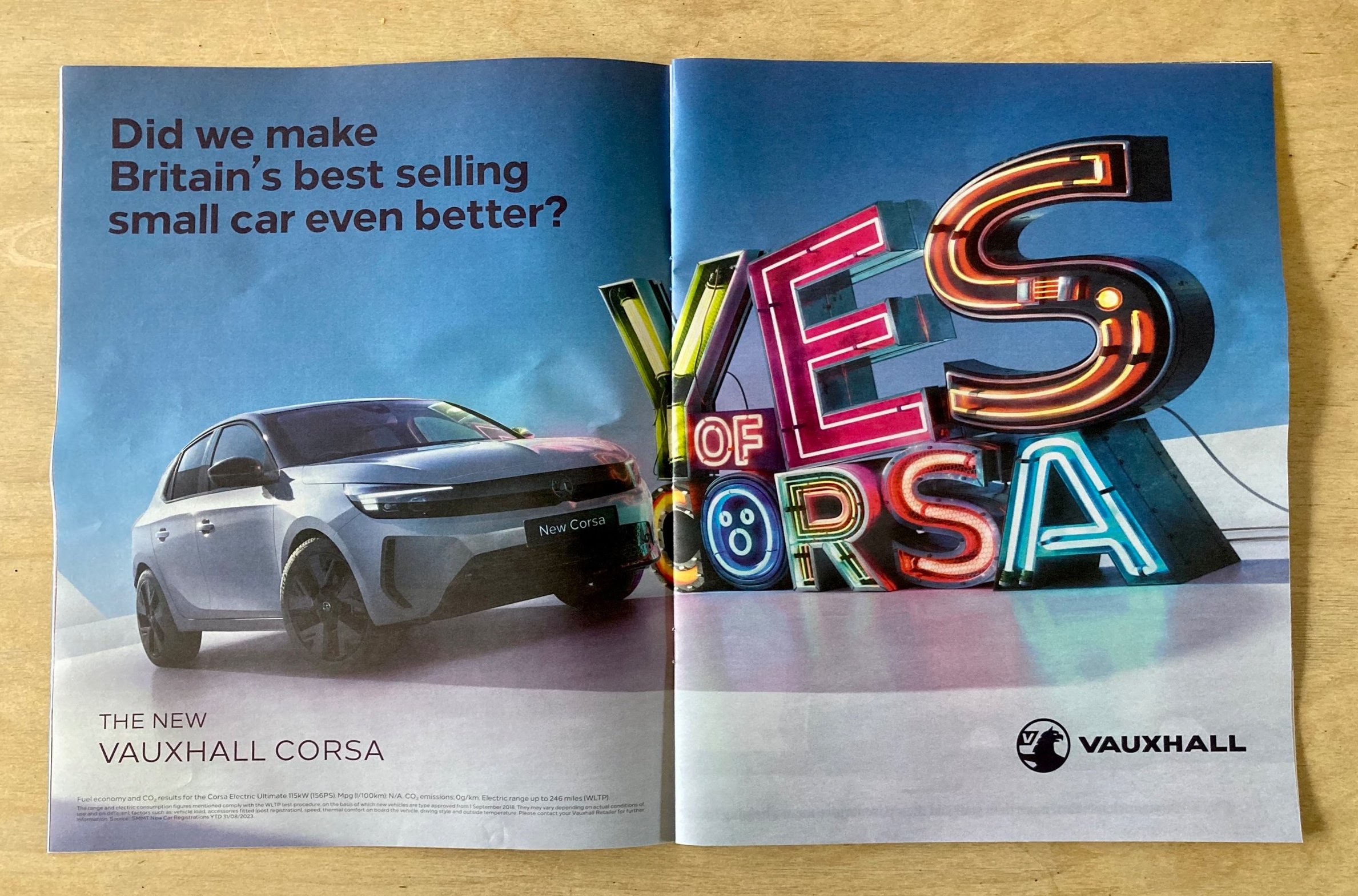
Take this double page spread from last Sunday’s Observer magazine. It tells me that the Vauxhall Corsa is Britain’s best-selling car and that it’s been improved. This information is there top left, in the place my eyes first land. Yet had you asked me today, just a couple of days after first seeing the ad, what the UK’s best-selling car is I wouldn’t have been able to tell you.
Despite being in the market for a new car – my ten year old Dacia has just clocked 100,000 miles – when I first flicked through the magazine this expensive two page advertisement for a major global brand created by – presumably – a team of professional people made no mark on my consciousness. The reason? There is no gap: no need or space for me, the reader, to do even just a little work to make sense of the message. And so, like 9,999 of the 10,000 ads we are said to encounter every day, it failed to do the job for which it was intended.
Now let’s consider another advertising message. This time a billboard from 1993, an all-time classic from ad legend Mark Denton …
There’s an image. And some copy. But this time I need to do a little bit of work. Right, so I know Michael Jordan plays basketball. But what has Isaac Newton got to do with this? Isaac Newton, Isaac Newton … gravity! And look, there’s a Nike logo. Nike make basketball shoes. With Air Jordan’s you defy gravity. Boom. Got it.
This process took me about 3 seconds, which is just about the amount of ‘dwell time’ I’d have had if I’d been walking towards this billboard or stuck in the traffic on Camden Road, where the photo of it was taken.
For a more contemporary example, how about this ad from last month for Lupin on Netflix?
The show is about a jewel thief. Fans of Lupin know this of course, and this is a campaign for them, to let them know that a new season is coming. But this doesn’t look like an ad for a drama. It looks like an ad for jewellery, yet one in which the jewellery is missing … wait, I get it, Lupin is up to his old tricks again. Bingo!
These ads leave a gap; a space just large enough for the reader to be able to join the dots. And the moment they do, they feel good. They get a warm, fuzzy feeling for having the smarts to be able to resolve the puzzle themselves.
The best work is simple, single-minded and distinctive of course, but more often than not it also uses this device; it makes the viewer or reader a participant in the message by having to do just enough work to make sense of it. Here’s another recent example for Spoke clothes. A twist on a cliché that rewards a little untangling.
The principle holds true in social media too. I liked this tweet from Royal Mail when England made the final of the Euros.
But I loved this subsequent tweet when England were defeated by Italy.
Employing the power of ‘the gap’ is a strategy that can work for TV commercials too, though the difference is usually that we’re kept engaged and hungry by our desire to know how what we’re seeing will be resolved, and this resolve is usually delivered at the end in a pay-off. Here’s a good recent example for BT from Saatchi and Saatchi.
Why is this home filled with stunts? Ah, ok, action movies. Got it.
The principle can even work in store. During the ‘partygate’ furore, a new sign appeared above the booze in Tesco’s. Though whether this was brilliant tactical marketing or a renegade employee I can’t say for sure.
So what’s going on? Well, as human beings we have an innate curiosity about our world and an irresistible urge to make sense of it. Yet most advertising is stultifyingly conventional. It conforms entirely to our predictions and so fails to prick our consciousness. And even if it does, the creators of the ad are so nervous of their message being missed, and so dismissive of the intellectual capabilities of their audience, that they leave no space for us in the communication. There is no gap. And a result the ad has zero impact, and all those meetings and Zoom calls and late nights were for nothing.
By contrast, in the examples of Nike or Spoke or Lupin, the creators have left the message unresolved. They have trusted us to bring the finishing touch; we’ve been given an essential role in the communication. And I don’t think it’s too much of a leap to say that we recognise and appreciate being given this respect by a brand.
There’s something else happening too, something that we’re only just beginning to understand with the benefit of neuroscience. Two recent research papers, which I originally came across in an article in Contagious magazine this summer, have explored the phenomenon of the ‘Aha moment’. The first one discovered that this feeling of making sense of something – of bridging the gap – ‘critically engages the subcortical dopaminergic reward network’. The second that it leads to an accelerated heart beat and a greater ‘mean skin conductance response amplitude’. In other words, your skin tingles and you feel nice.
So, employing the gap as a strategy not only makes your message distinctive, memorable and effective, it also shows your audience that you respect them. Plus, it means that your advertising isn’t just irritating clutter adding to the chaos and complexity of 21st century living, it’s actually making the world a - marginally - better place.
Oh, and given the ongoing debate around the use of AI and the threat to the jobs of copywriters and art directors the world over, it’s worth adding that the principle of ‘the gap’ is something that ChatGPT, based on all the evidence I’ve seen, will struggle to replicate. It relies on a human shaped hole that machine learning, by definition, is unable to fill. It’s a theme explored in this brilliant thread from the copywriter Vicki Ross – ‘Lines I don’t reckon AI could write’.
If you’re curious to start experimenting with the gap yourself, there’s a simple technique you can try. Once you have a concept for your ad, pare the copy right back. All the way back, until it makes no sense. Then try adding a word or a phrase back in. By doing this incrementally you’ll discover the sweet spot, where there’s just enough space for your reader to make the final leap. The more dwell time you have – say on a tube card – and the more sophisticated your audience, the bigger the gap you can leave.
Before you hurl yourself into the gap, I should strike a note of caution.
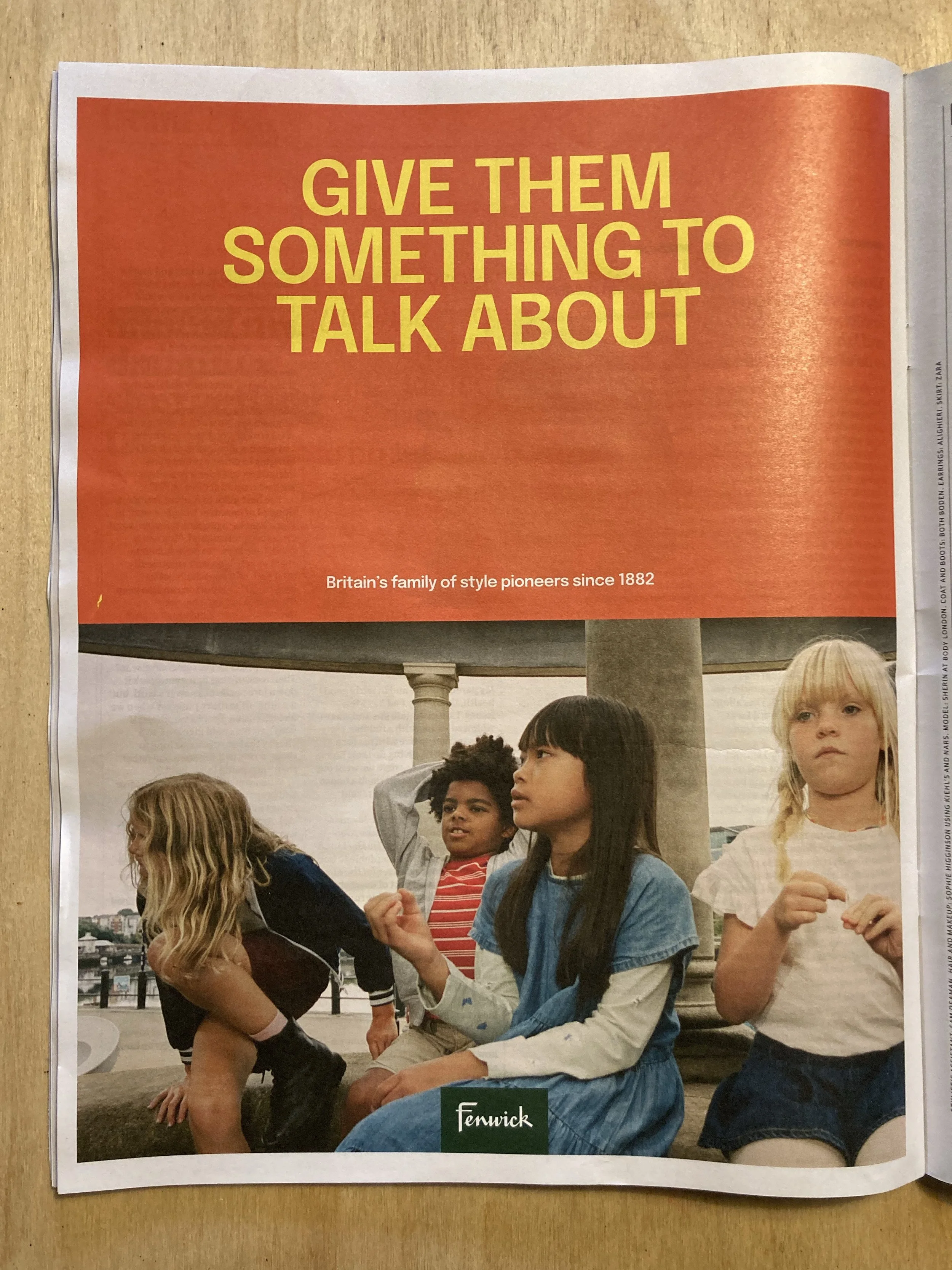
Here’s another ad from last week’s Observer magazine. This time for the department store Fenwick.
Nope? Me neither. I have no idea what’s going on here. In this case copy + image + logo makes no sense. There’s not enough information: the gap is too big. The ad actually caught my attention - and held it - by virtue of the lack of resolution. But the warm ‘aha’ feeling described above never came to pass. It still hasn’t. Instead, in its place, irritation, frustration and befuddlement; emotions unlikely to encourage me to cross the threshold of Fenwick’s.
The comedian Jerry Seinfeld has used a simar analogy to the gap in talking about how comedy works. He talks about a joke occupying the space between two cliffs. The audience has to trust the comedian to leap across that space with them. If there’s no distance between the cliffs then the leap is unremarkable and there’s no feeling of satisfaction – the joke is ‘meh’. Conversely, if the gap is too big, the audience fall in the space between and you’ve lost them (à la Fenwick’s). But judge the gap just right and you’ll have the audience eating out of the palm of your hand.
So, next time you’re working on a piece of creative go big on simplicity, single-mindedness and standing out for sure, just don’t forget to leave a little room for your audience too.


